I am a full stack developer. I develop in Visual Studio, code in C# with .NET Core, deploy to Azure and I must admit, I’m a front-end cheater.
Comeon, the .NET Core Web App demo itself loads with Bootstrap and JQuery preinstalled. We’re all cheaters at some point, but I’m trying to diversify my cheating and eliminate my dependencies.
Here’s my latest strategy.
Goodbye Bootstrap, HELLO Bulma!
Anything Bootstrap can do, Bulma can do better!
Well, not exactly but let me explain why.
Bulma has NO JS file.
The only time I feel a need for JS? Maybe JQuery Datatables, but I make a specific “DataTableLayout” and only use JQuery tables if required. This coupling of Bootstrap and JQuery is itself what I was trying to move away from.
Almost everything else? Columns, tables, hero images? Bulma does it all!
I want style to be style.
I’m not a fan of my hover, form validation, etc being done by JS. HTML5 has increased it’s validation options, and CSS is rich in transformation. Why am I forced to bring in JQuery and then various animation libraries just to get some simple text animation.
It’s frustrating to have so much code that I’m dependent on when I can do columns, tables, cover designs, and more with ONE SINGULAR CSS file: Bulma.
I want flair!
So this works great, everything loads quickly but there’s no “animation”, no “flair”.
What now? Do I succumb and just go ahead and import JQuery and WOW.js? I mean I could…
Or, I could pick and choose my animations with something like : Animista. It has a great UI, I can pick and choose exactly what I need and nothing else. If there’s ever a problem, well, I comment out that CSS and back to plan Bulma we go!
Example
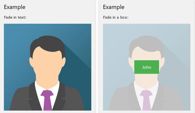
So, I wanted to do a simple mouse over. User mouses-over image and words appear. I followed the basic CSS/HTML example from W3Schools and got that to work pretty quickly (I replaced the “container” with the “flip” class to avoid Bulma conflicts).
For flair, I visited Animista for an example of a slight blur-to-focus on words and worked to combine it’s animation with my mouseover. This is the result…
Here’s the HTML:
<div class="flip">
    <img src="~/images/flip_images/branches.jpg" alt="Avatar" class="flip-image" style="width:100%">
    <div class="flip-middle">
        <div class="flip-text"><a href="/Home/Locations">LOCATIONS</a><br /><div class="is-size-6">Over 80 Years of Service</div></div>
    </div>
</div>
Here’s the CSS (a combo of the W3 + Animista):
.flip {
    position: relative;
    padding: 0.3rem;

}

.flip-image {
    opacity: 1;
    display: block;
    width: 100%;
    height: auto;
    transition: .5s ease;
    backface-visibility: hidden;
}

.flip-middle {
    transition: .5s ease;
    opacity: 0;
    position: absolute;
    top: 50%;
    left: 50%;
    transform: translate(-50%, -50%);
    -ms-transform: translate(-50%, -50%);
    text-align: center;

}

.flip:hover .flip-image {
    opacity: 0.3;
}

.flip:hover .flip-middle {
    opacity: 1;

    /* below credit of Animista*/
    -webkit-animation: text-focus-in .5s cubic-bezier(0.550, 0.085, 0.680, 0.530) both;
    animation: text-focus-in .5s cubic-bezier(0.550, 0.085, 0.680, 0.530) both;
}

.flip-text {
    font-size: 2rem;
    font-weight: 600;
    line-height: 1.125;
    color: #565656;
}

/* ----------------------------------------------
 * Generated by Animista on 2018-8-7 13:40:21
 * w: http://animista.net, t: @cssanimista
 * ---------------------------------------------- */

/**
 * ----------------------------------------
 * animation text-focus-in
 * ----------------------------------------
 */
@-webkit-keyframes text-focus-in {
    0% {
        -webkit-filter: blur(12px);
        filter: blur(12px);
        opacity: 0;
    }

    100% {
        -webkit-filter: blur(0px);
        filter: blur(0px);
        opacity: 1;
    }
}

@keyframes text-focus-in {
    0% {
        -webkit-filter: blur(12px);
        filter: blur(12px);
        opacity: 0;
    }

    100% {
        -webkit-filter: blur(0px);
        filter: blur(0px);
        opacity: 1;
    }
}
/* ---------------------------------------------- */
The result is a simple animation: you mouse-over an image, it fades and a transparent, white overlay appears. An animated word blurs into focus at dead center so that you can click to follow the link.
Pure CSS! (Bulma + Animista mods)
So, Why So Much Trouble?
I had a site last year that was and IS crucial. It accepted payments. It required a very specific version of JQuery for its own library to work, encrypt credit card numbers and send to API (thus not storing and avoiding PCI compliance). That’s fine, but with the design I had then, I had a different version of JQuery, along with a slew of libraries. The libraries did everything from cover background images, to animation, to form validation and whatnot. I stripped everything down and it did work. Somewhere in there, though, one of the libraries clashed with a new release of Edge and caused tons of complaints about invalid credit cards via API. All errors related to form dropdowns in Edge.
Chrome and Firefox handled it fine.
TLDR; Summary, Lesson Learned:
MINIMIZE YOUR DEPENDENCIES.
and that’s what I’ve started to do.


